Thursday, July 31, 2008

Open House - Plaza Ballroom

The Regent Theatre's Plaza Ballroom in Collins st

Another 'better late than never' post I'm afraid! These shots are from the Regent Theatre's Plaza Ballroom, also on show as part of the recent Open House event in Melbourne's CBD.

The ballroom, built in 1929, is lavishly decorated in ornate Spanish Colonial style - features include an indoor fountain, curved 'Juliet' balconies, bronze chandeliers, highly decorative faux windows (backlit to simulate moonlight!) and ornate handpainted ceilings (pictured below).
A little kitsch, but utterly breathtaking.

Incredibly, the Plaza Ballroom as it stands today is a complete restoration of the original, which was destroyed by fire in 1945.

I just discovered another lovely photo of the Ballroom, and a collection of very sneaky photos of the Open House Capitol Theatre tour on a blog called the grapevine. Read the text too - very funny!

ornate detailing with a Spanish influence

Intricate decorative patterns on the ceiling (top image) and even in the carpet! (bottom image). Apparently parquetry flooring is laid over the top of this carpet when required. Big job!

Gargoyles guard the exit

Measure by The Foundry


I briefly mentioned these lovely new products by Melbourne design studio Foundry last week after seeing them at Design:Made:Trade. Such a great execution of a simple, clever idea... I thought I should show you more of the collection.

Measure is a range of paper products that provide useful household information in a slick graphic, easy to access format. The range includes 'Produce in Season' - showing seasonal produce not only here but the Northern hemisphere too (and in both English and Italian), 'Everyday' for all those important conversions like kilos to ounces, Celsius to Fahrenheit and centimetres to inches... (and all in 5 languages....!), and 'Lunar Phases' (hey, these things are important.)


The Measure range also includes a height measurement chart, yearly calender and wine booklet (very handy to translate those baffling descriptions on the side of wine bottles). The range is the creation of Melbourne graphic designer Jessie Fairweather, who brings to her business a wealth of experience from years spent overseas - including a stint at the prestigious Fabrica research centre in Italy (yeah, the one Jaime Hayon came from!).

Prices range from a very reasonable AU$14.95 - AU$24.95. Not sure currently where these will be stocked as they have only just been released - I'll be sure to keep you posted! Potential stockists can email info@thefoundry.com.au

Wednesday, July 30, 2008

Zip Zip USB Memory Brick


Thought I would mention some more excellent Australian product design whilst on the topic.

I found myself sitting next to a lovely young chap called Edmund (I hope the spelling it correct) at the Design Capital event just over a week ago. We got chatting whilst the grown-up designers 'networked'... and he mentioned this cute USB memory stick he designs and manufactures.

It's called the Zip Zip USB Memory Brick - it comes in 1 GB (US$35), 2 GB (US$50) and 4 GB $US75). It is NOT affiliated with Lego, and just between you and me, I think they are slightly peeved that they didn't think of it first.

Anyway... I made Edmund give one to Nendo's Oki Sato after the lecture... hope he liked it!

Buy your own here.

Minna Fold Bowls by Nina Ellis

Some interesting new product design from Melbourne here... Jewellery designer Nina Ellis has just released a series of anodised aluminium fruit bowls names Minna Fold Bowls, sold through the wonderful Pieces of Eight gallery in North Fitzroy.

Its an interesting transition for Nina - from unique, painstakingly handcrafted jewellery to the development and manufacture of these functional, geometric and sculptural pieces. They retail for $245.

Nina Ellis completed a BFA in Gold & Silversmithing at RMIT in 2003. She has been the recipient of a number of awards including the Craft Victoria Mentorship, Emerging Artist Initiative, and the SIEMENS Fine Art Scholarship Award in 2003. She has since exhibited widely both nationally and internationally, and currently works from the lovely Pieces of Eight studio workshop.

Nina Ellis' work is currently on display in the Pieces of Eight window exhibition, and some more info on the process behind her designs can be found here on the Pieces of Eight blog.

Tuesday, July 29, 2008

Open House - Council House 2

mechanical timber shutters on the facade of Council House 2 in Melbourne

Better late than never with this one... sorry, I took the Open House tour of Melbourne CH2 (Council House 2) building over a week ago (July 20th) and am only getting around to posting about it now... aaaggh. What can I say - it's been a busy fortnight! Anyway... thought it might interest Melburnians to see some shots inside the stunning Council House building. Over 25,000 people turned out on the day to take a peek inside 9 of Melbourne's most famous buildings... the queues around were INCREDIBLE! Many waited around 2 hrs at some locations... jeepers. It's fantastic that so many people braved the cold to learn a little more about some of Melbourne's architectural masterpieces... but next time I think it might be wise to allocate viewing times and tickets in advance!

Those in the know will be aware that CH2 is the first purpose built office building in Australia to achieve a 6 green star certified rating. This rating is a measure of the building's energy and water efficiency, quality of environment and resource conservation. It seems every detail has been considered in achieving this rating - special 'night-purge' windows open every evening to allow the night breeze to naturally cool the interior of the building... a water-mining plant in the basement treats and recycles water for washing, cooling and watering of plants, and the striking facade of louvered timber shutters track the sun to control the temperature of the building. More detail here.

I was most impressed with the incredible rooftop garden - those lucky council employees get to eat their lunch up there everyday... aghh! Beautiful.

CH2 facade

CH2 stunning sculptural reception desk on the ground floor
CH2 rooftop garden

view from the top.... ahhhh!

interior - the 'wave' shaped ceiling maximises air flow and makes heating and cooling more efficient. Those 'radiator' looking things on the ceiling are actually chilled ceiling panels, circulating cold water to absorb radiated heat from occupants and equipment. The concrete ceilings also absorb excess heat.

Monday, July 28, 2008

Paper Tiger


The Paper Tiger stand at Design:Made:Trade in Melbourne last weekend

I can't believe I forgot to add these shots of the Paper Tiger stand when I posted about Design:Made:Trade last week! It was one of my favourite stands, featuring a slick, well-designed booth, and showcasing the Paper Tiger stool - one of the most innovative, interesting examples of Australian design in recent years. Shame on me.

The Paper Tiger stool is an excellent solution for temporary, sustainable seating. The stool simples folds and slots into place from flat-packed cardboard - no tools or fixings required. Obviously the design also offers great opportunities for different patterns, colours, graphics and corporate signage etc to customise the style relatively cheaply. More shots of various colourways here and here.

The Paper Tiger stool is made in Australia from recycled cardboard. It has a lifespan up to 2 years, and is load rated to 150kg. It was designed and released in 2007 by Melbourne-based designer Anthony Dann, and won the 2007 Indesign Launch Pad award for sustainability in that year.

Anthony Dann recently developed a new range of furniture and lighting presented at this year's 2008 Salone in Milan, and he will soon be broadening the range of Paper Tiger Products to include a bookshelf, table, wardrobe and children's chair.... I'll keep ya posted!


Friday, July 25, 2008

Interview - Sibella Court


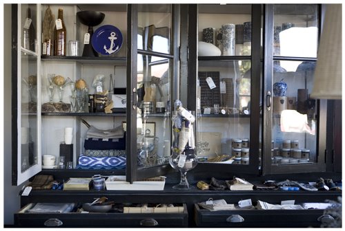
images styled by Sibella Court

If, like me, you compulsively read every interiors magazine in the country, you might have noticed the name Sibella Court popping up here there and everywhere in recent months. In the short space of 6 months or so, Sibella's dreamy NY loft was featured in Inside Out magazine... she's been a featured contributer to both Inside Out and Vogue Living magazines, and there's been a flurry of media attention surrounding the recent opening of her new shop in Sydney - The Society inc. All this attention sparked my curiosity, so i thought I'd find out a little more about the mysterious Ms. Court.

Sibella Court is an interiors stylist from Sydney who has spent the last 9 years living in New York, working for clients including Vogue Living USA, DKNY, Bloomingdales, and Bergdorf Goodman amongst many. She recently returned to Sydney to open her beautiful shop in Paddington, filled with all kinds of special homewares and eclectic finds inspired by her many years overseas. Ahhhhhh. What an incredible creative, exciting, inspiring way of life :)

Sibella's style is eclectic, bohemian, feminine and quirky. She's not one to shy away from bold, clashing colours, striking patterns and textures, or different cultural references. Her work has a sense of 'realness' rather than sterile, flawless beauty.... each image seems to strike a careful balance between new trends and well-loved vintage style - bringing a sense of history to the work. The result is an engaging portfolio that tells something of Sibella's own colourful story.

A big thankyou to Sibella for her precious time, and to her agency RP Represents for facilitating this interview!

You’re originally Australian, but have spent many years working in New York with some incredible high profile clients, before returning home recently. Tell me a little about your varied background - what did you originally study, and what path led you to what you’re doing now?


Received my BA in history from Sydney University and started styling before I graduated at 20.
After a year of assisting became very busy on my own. My mother had an amazing eye and knowledge of plants, shells, textiles, art, crafts, literature and everything in between.
Both she and my father taught me to notice the detail.

It must be a very exciting time for you with the recent opening of your shop in Sydney! How long have you been hatching the plans for The Society Inc, and what challenges have you found in realising your vision?

The Society inc has been discussed and fine tuned for about 2 years. After looking for spaces and then about to in a lease on a space on Greene Street in Soho I decided to carefully consider the 10 year lease with a trip to Australia. Whilst there I made a very sudden decision to move home. Decision made, I extended my holiday to 3 weeks instead of 5 days then flew back to the US and wrapped up my whole life in 7 weeks. I flew out the day after all my shoots finished followed by a 40 foot container. 4 storage spaces and a 2000 sq ft loft worth of props and inventory for my shop.

I went straight into action in Sydney and after a few short months bought the building that my shop is now housed in. A beautiful 1860’s corner shop in Paddington! The biggest challenge has been after living a very ‘buy&live as you please’ lifestyle to having a mortgage.

The Society inc

A lot of creative professionals say that they love the creative side of their job, but hate the paperwork, marketing and the ‘business’ side of things. How do you manage to balance these necessities with the creative side of your job?

I enjoy all parts of the business both creative and managerial. I believe in a tight infrastructure. I prefer not to do paperwork so have always hired bookkeepers, financial advisors and accountants to take care of that side of the business so I can focus on the fun stuff.
On the marketing side, I get so excited about my projects, whether it be the shop or concepting/designing a shoot, that its contagious and I end up being a walking talking PR.
As a large part of my job is meeting new people, talking to PRs, dealing directly with photo&magazine editors, photographers and general ‘girl about town’ this lends itself to all sorts of promotion.

Having a fantastic agent, RPR, behind me: organising and dealing with clients, is as essential as great financial people. To know you're in good hands, lets me focus on beautiful things.


Readers would have seen your beautiful New York home in the May/June issue of Inside Out magazine. How would you describe your own style when it comes to architecture/interiors? How has this style developed over time? Do you think this personal aesthetic carries through in your editorial work?

My personal style definitely carries through all my work.
I suppose I have fine tuned my look along the way both with confidence and knowledge.
My own style is usually a bohemian mix of beautiful things that are both old & new, well-travelled, pre-loved and quirky. Most pieces have a story which I am happy t tell.
In life, I am a collector. I have a love of the found object. However a the end of the day a ball of string can get me excited.

However, despite all this, when I build my own house (house of dreams) it will be Comfortable Modern. Just the essentials: good strong lines, chalky warm whites, great bed, fireplace, all the cooking utensils, flat screen TV, to die for linen lounge , great light, indoor/outdoor.

Sibella's NYC loft apartment (image from Inside Out, May/June 2008)

Which designers, artists or creative people are you inspired by?

Ilsa Crawford, Cy Twombly, Mark Dion, Noguchi, Brancusi, Matisse, James Merrell, Hella Jongerius, Terence Conran.

Where else do you find inspiration – ie books, magazines, your environment, travel, your family and friends?

My mother, travel-places that assault all the senses
Reading history books on Darwin, Tradewinds, Colour anything really
Beachcombing- anything in nature from colour combinations, form, composition.


What does a typical day at work involve for you?

Anything or all of this: Flower markets, shopping, building sets, negotiating with PRs, carrying bags moving furniture, not sitting down/running-all for a beautiful photograph.

What are you most proud of professionally?

Opening The Society inc.

The society inc. interior (image from Vogue Living)

What's the best thing about your job?

Constant change. Ability & opportunity to take your job anywhere in the world. Being asked to do a paint range.


And the worst?

Hundreds of bags & boxes.

What would be your dream creative project?

To travel all year buying beautiful things from faraway places for my shop.

To make my own perfume scent and design the bottle

What are you looking forward to – professionally or personally?

Health, Wealth & Happiness

Sydney/NYC Questions –


What will you miss most about New York?

The accessibility of product.
The open all hours policy of NYC.

What and where was the last great meal you ate in Sydney?

Donna Hay’s house for fish & chips
Or
Longrain for Betel Leaf with prawn & kaffir lime leaves and other delicious secret ingredients.

Where would we find you on a typical Saturday morning?

Coffee. Orange Grove organic market buying plants (starting my own potted Garden of Eden) & coffee followed by browsing at furniture auctioneer house, Raffan & Kelaher. Then Relish for my final coffee before opening The Society inc for trading.

Sydney’s best kept secret?

The Society inc.


The Society Inc
18 Stewart st
Paddington
NSW

Tues-Fri 12.00pm-5.00pm, Sat 10am-5.00pm

Styling enquiries to RP Represents

Thursday, July 24, 2008

Design:Made:Trade

Design:Made:Trade was a welcome addition to the State of Design line-up this year... the 4-day trade event took place last Thursday 17th - Sunday 20th at the Exhibition Building in Carlton, and was also open to the public on the Sunday. The idea for this new event is to showcase Australia's small manufacturers, product designers, and design makers. The event was specifically created for designers seeking collaboration with manufacturers, retail and export buyers. Lots of great independent design was on show, some I'd seen before, but also some really interesting new companies I wasn't aware of.

The best thing about Design:Made:Trade is that it separates these smaller design firms from the sprawling Furnitex/Decoration + Design event, giving them a more specialised environment in which to show their work.

Also I loved the design of the exhibition itself - cardboard fold-out booths gave it a low-fi, sustainable feel (although... I'm not sure what happened to all that cardboard afterwards!... I hope it got recycled.)

*update - Just heard from Melbourne-based design house Buro North, who are responsible for the excellent exhibition design at D:M:T. They have confirmed that all materials used in the project were recycled after the event, in collaboration with VISY. (see comments below) Wicked.

Highlights below:

Samantha Parsons of Studio Sam chats to visitors

Studio Sam products - above, Siena the book block table (available from Format Furniture) below, custom-embellished plates created by Samantha for the Eat Green Design event

Stunning textured wallpapers by Ilias, inspired by braille. I love the colours and the flocking - also he's branching into rugs and showed the first rug in his range.

New typography/graphic design company The Foundry showed some beautiful simple printed products, with as much emphasis on well-researched content as aesthetic appeal. In particular I loved the 'produce in season' wall chart... I'll write more about The Foundry next week - I think they deserve a post of their own!


The Foundry's 'produce in season' wallchart

Yellow Diva's striking pieces

Marc Pascal's colourful hand-made lights

It was lovely to meet Volker Haug in person after interviewing him a while ago for this site! He was so nice and friendly... wish I had more time to chat! (I was frantic as usual getting all my photos...) He showed a small selection of his fantastic lighting range...

Tractor Home had a gorgeous stand full of hand-made treasures from South Africa... including some of superstar South African designer Heath Nash's work. Nash makes his pieces from discarded plastics, combining different colours to create the most fantastic homewares and lights... I must visit the Tractor Home retail store! Stunning stuff.

Wednesday, July 23, 2008

Design Capital (including Nendo!)

Nendo's Oki Sato at Design Capital last week

I was very lucky to attend part of the State of Design Design Capital event last week... particularly as I managed to catch one of my all-time favourite international design heroes - Oki Sato of Japanese multidisciplinary design firm Nendo. I have written about Nendo before - I LOVE THEM.

Oki Sato was not at all the aloof, reserved man of few words you might have read about... he was utterly charismatic and entertaining, charmingly self deprecating - and nothing beats that Japanese/Canadian accent! I was completely smitten.

The best bits:

- Sato's cute hand-drawn timeline of his life and career to date, citing influences such a reading manga as a 6 yr old, and starting a job placement agency representing 500-600 students temp workers at age 22 ('I don't know why I did that').

- Observations Sato made at age 10 when his family moved from Canada to Japan - 'in Canada you can wear you shoes wherever you like... in Japan you have to take 4 pairs of shoes wherever you go'.

- Sato's story about creating fake shadows to accentuate his 1% product range at IFF Tokyo in 2006. Nendo had no budget for custom lighting for their booth... so instead Sato photographed the shadow of each piece, and covered the floor with a printed film mimicking these shadows thrown by spotlights. The effect is fantastic! Only one problem - everyone at the fair thought they were exhibiting lighting concepts and would photograph the ceiling rather than their furniture! More info here.


Nendo's 1% range shown at IFF Tokyo in 2006

I thought the 9 PAGES of notes I furiously scribbled down would best convey just how enthused I was by Sato's presentation, so I included them for you to decipher:


furious note-taking during Oki Sato's presentation

But it wasn't just Oki Sato who stole the show... Design Capital offered so many great speakers from all areas of design... it was a truly inspiring line-up. Michaela Webb of Studio Round was another stand-out for me. Her innovative, experimental approach and the idea of 'creating an experience' rather than just a graphic solution really spoke to me... I must profile this company in more detail at a later date... in the meantime their website is fabulous and so is their portfolio (check it OUT).

Design Capital goody bag - pamphlets, paper, stickers, and a copy of inside magazine... always love a good showbag.